Transforming members’ UX at a leading Ukrainian Credit Union in Ontario
Research & website redesign for BCU Financial Group
#Case study
Craft Innovations helped BCU Financial Group rethink its digital identity while staying true to its cultural roots and brand’s long-standing values.
Client
BCU Financial
Location
Canada
Industry
Finance and Banking
Timeline
9 months
About the Client
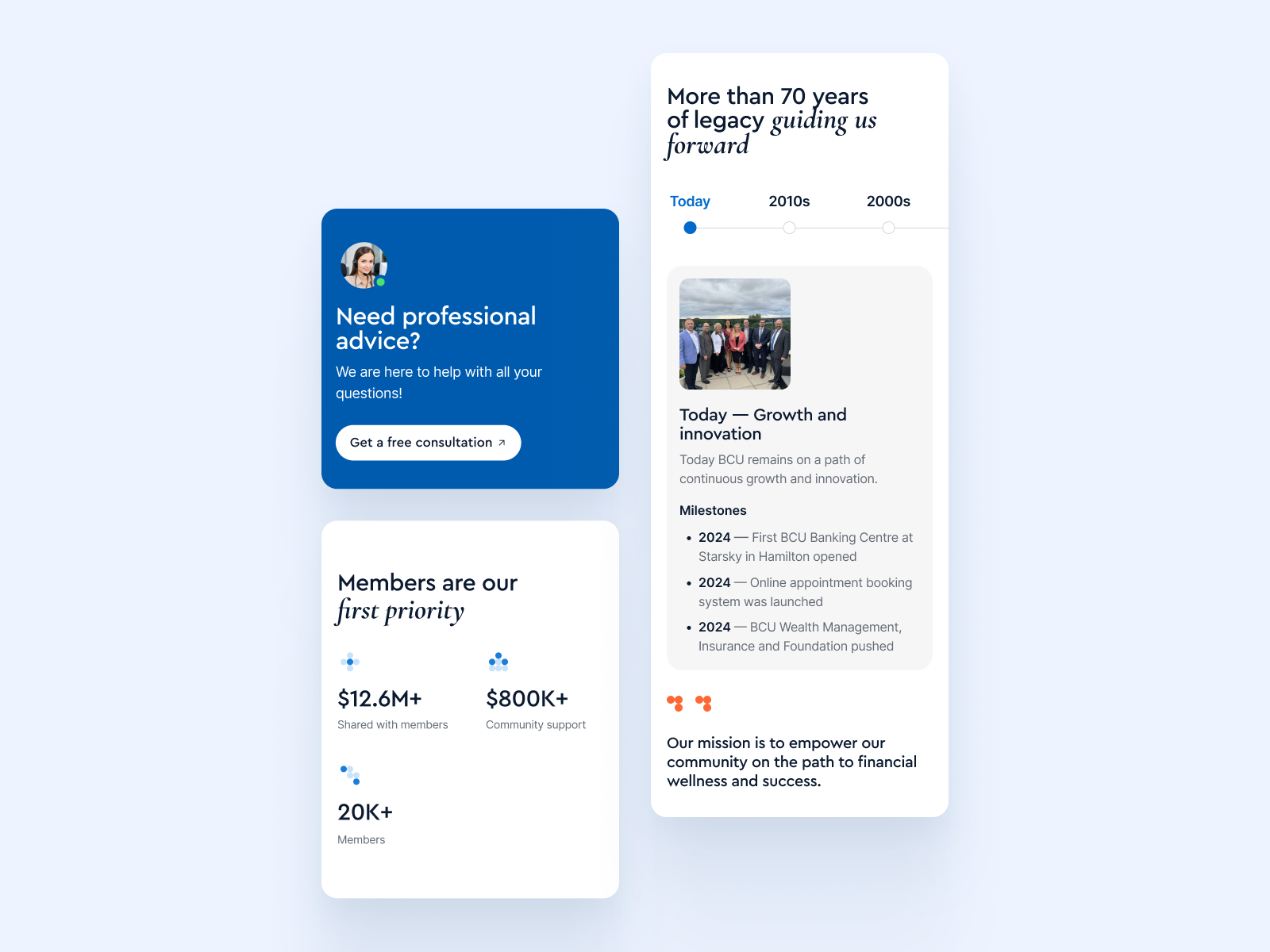
Established in 1952, BCU Financial Group is a leading Ukrainian-Canadian Credit Union that now serves more than 20,000 members across Ontario. It offers a full range of banking services, including personal and business accounts, loans, mortgages, financial planning, insurance, wealth management services and more. The group serves members through BCU Financial, BCU Insurance and BCU Wealth Management entities.
Project Goals
The customer profile in the financial services industry is evolving. Digitally savvy, digital-first consumers are gradually replacing traditional customer segments. At the same time, banks and credit unions face increasing pressure from fintechs and neobanks competing for a greater share of the customer’s wallet.
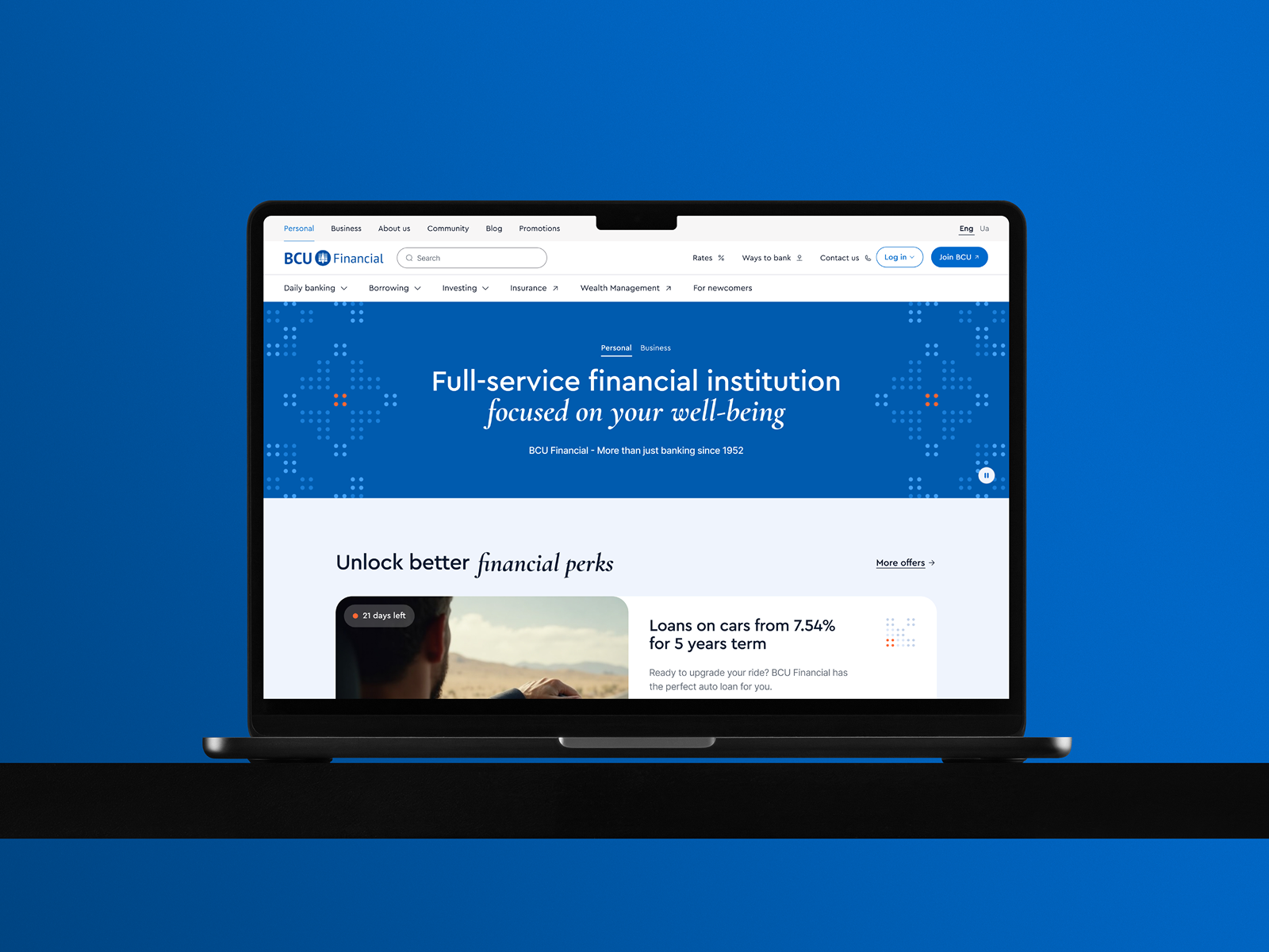
As a future-focused organization, BCU Financial embraces this shift and actively works to enhance the member experience across both physical and digital touchpoints. A key component of this strategy was strengthening their digital presence by redesigning their corporate websites—modernizing the BCU brand to better resonate with a new generation of community members.
Throughout the project, we focused on 3 key objectives:
Improving User Experience. Streamline website interactions to be more intuitive, so different user groups – new clients, existing members, and businesses – can quickly find and access the products and services they need. Simplify navigation and structure the content to help users find useful information faster.
Driving Business Outcomes. Improve key metrics such as online applications for new accounts & loans, conversion rates, user engagement, and overall member base growth. Encourage existing members to engage more actively with digital services and boost online service adoption. These objectives also supported customer retention and helped reduce churn rates.
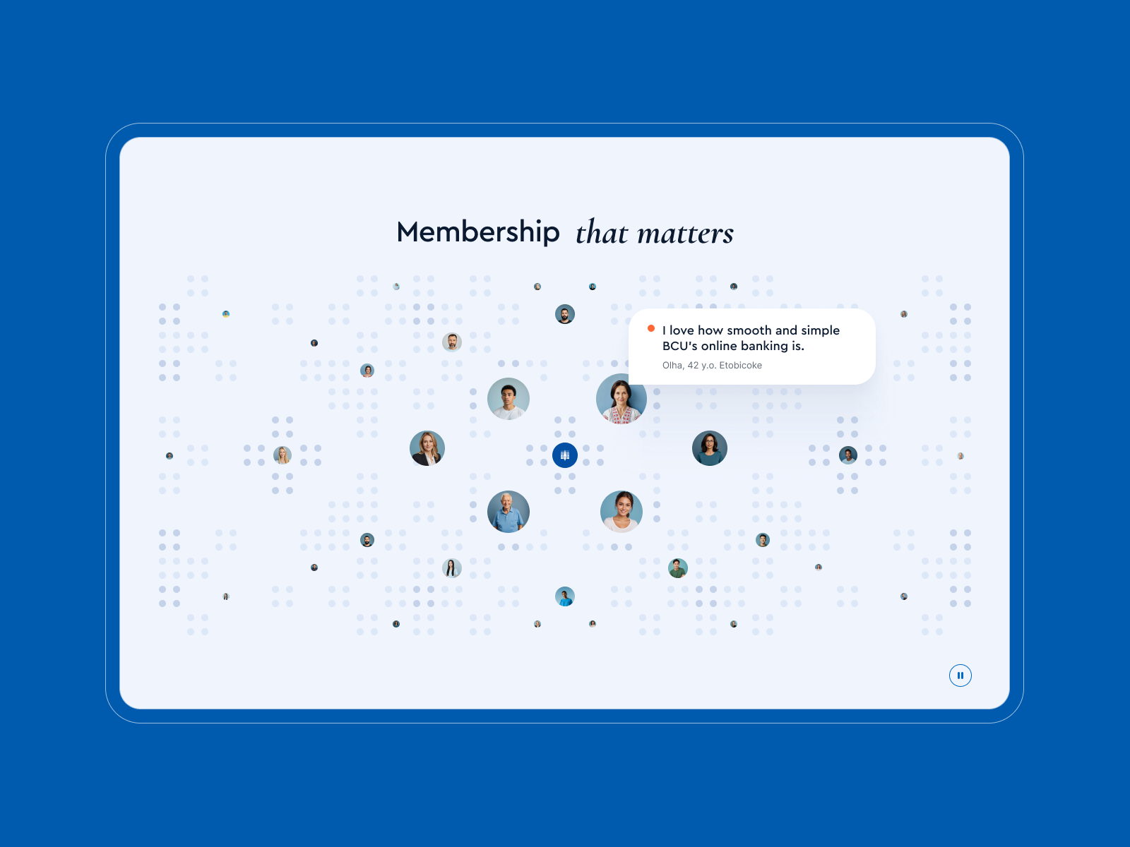
Strengthening Brand Perception. Position BCU as a modern, community-oriented institution that inspires trust and loyalty among existing and prospective members. Blend current visual trends with the corporate identity to reflect the look and feel of a leading financial institution.
Challenges
Like many long-standing websites, BCU’s digital presence needed a fresh start. The current sites were functional but a bit outdated. Together with the BCU team, we decided to rethink the entire experience.
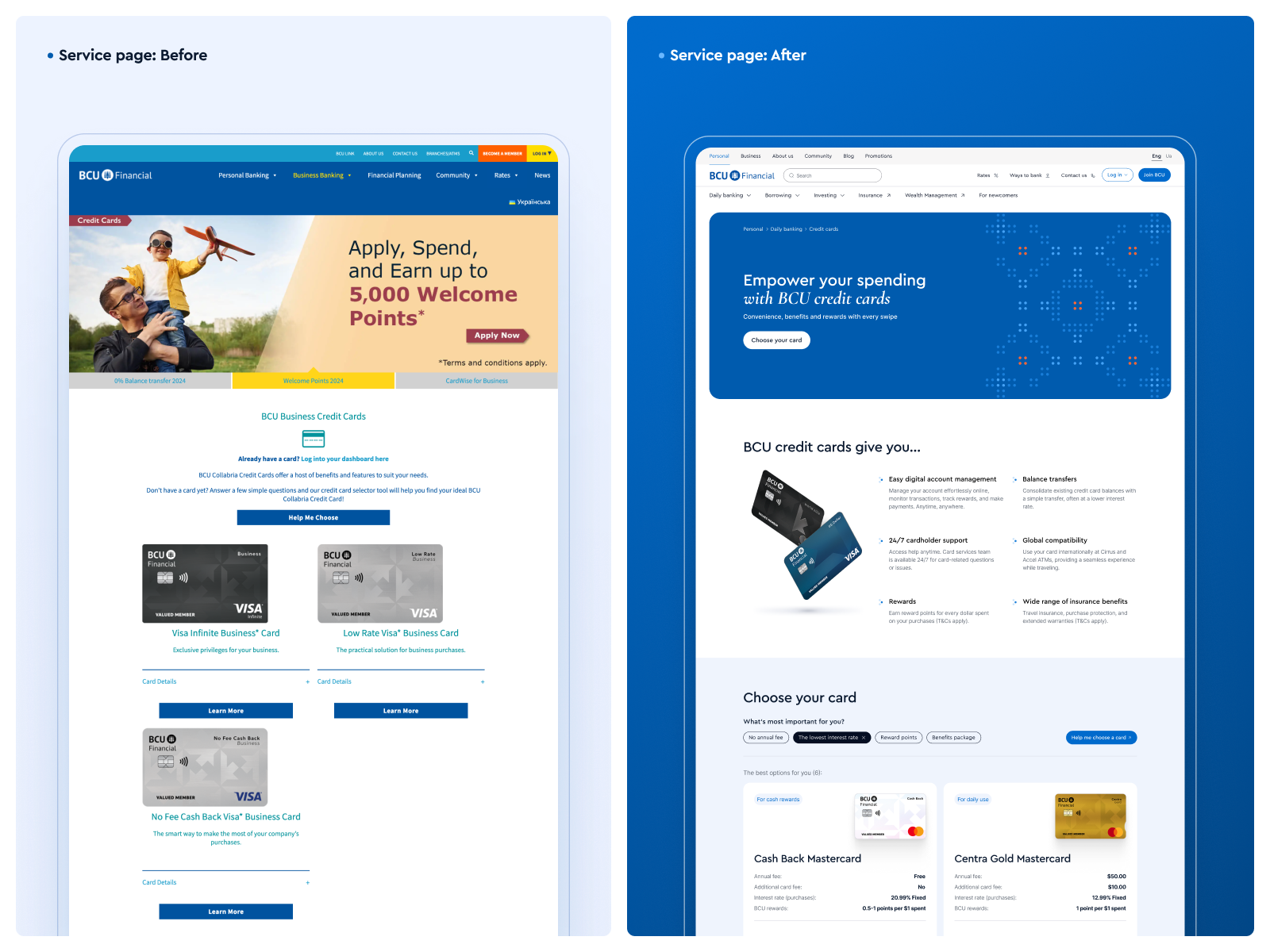
Revise navigation and informational architecture. The existing websites had a solid structure, but there was an opportunity to improve navigation by refining the menu logic, adding breadcrumbs, and eliminating dead ends. We worked with the BCU team to improve visual literacy and findability, giving users a more intuitive browsing experience. Moreover, we revisited the original information architecture and expanded it with subcategories and product-level pages, helping users access relevant content more easily. The updated structure also followed SEO best practices – supported by insights from BCU’s in-house marketing experts.
Create a consistent UX. Each of the 3 websites reflected different stages of BCU’s digital evolution, with unique visual styles, layouts, and hierarchy. Building on this, we had to align the visual language, typography, and overall design system, creating a consistent UX across all sites.
Align content with user needs. Some pages didn’t have enough content and missed key product details. Together with the BCU team, we revisited the content, building dedicated product pages, adding clear descriptions, and fine-tuning UX copy to fit the user context.
Enhance the use of visuals. The updated design included more visuals than the existing image library could support. We filled the gap using MidJourney and advanced AI prompting to create high-quality images. We also ran a hands-on workshop for the BCU team on how to use MidJourney for the future content needs.
Meet accessibility standards. BCU had accessibility guidelines in place, and the goal was to meet WCAG 2.1 Level AA and comply with AODA standards. We created an internal accessibility checklist for design, tested with tools like WAVE, and worked closely with developers to ensure full compliance.
Ensure smooth development workflow. With a large amount of development involved, we needed to double-check every flow and every screen. We created detailed checklists and worked closely with our external development partner. We also provided full support to BCU’s internal team, including WordPress admin panel training, step-by-step guidelines, Loom video overviews, and ongoing support.
*In case clients bring in their own developers, we also stay involved until the final release – making sure that what we designed works and looks great.
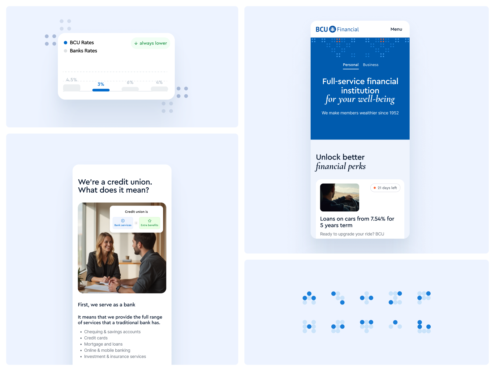
Process sneak peek
1/9
1/9
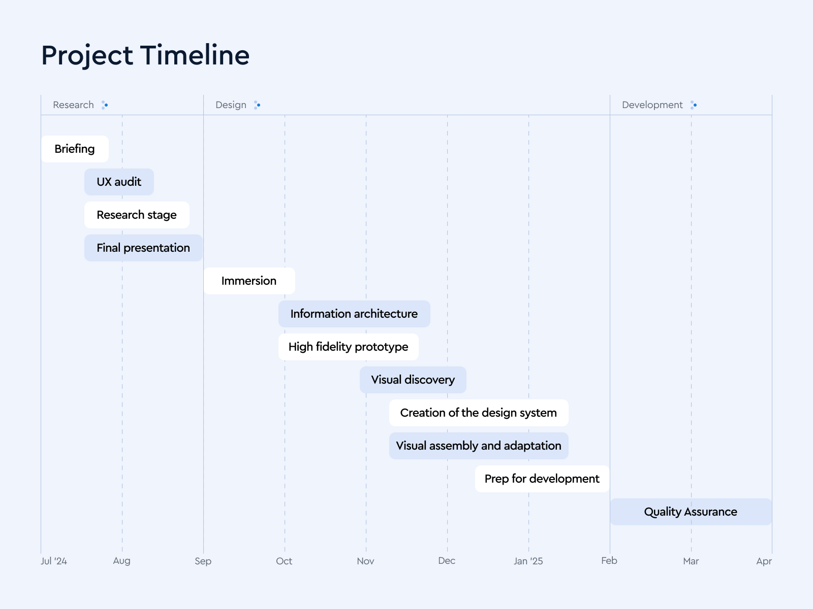
To keep things focused, the project had 3 key stages: Research, Design, and Development. Research focused on analyzing banking experience in Canada and building a data-driven foundation for relevant customer value propositions. Design involved structuring information, creating prototypes, and crafting a consistent UI. Development covered implementation and QA to bring new vision to life.
2/9
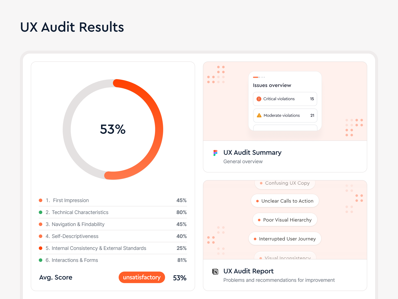
To uncover usability issues and improve the overall experience, we ran a UX audit across the websites. UX audit helps reveal pain points, identify areas for improvement, and ultimately create a more user-friendly and effective website. Our experts reviewed all sections using a UX checklist and our original Usability Principles – developed through years of research and practical audit work.
3/9
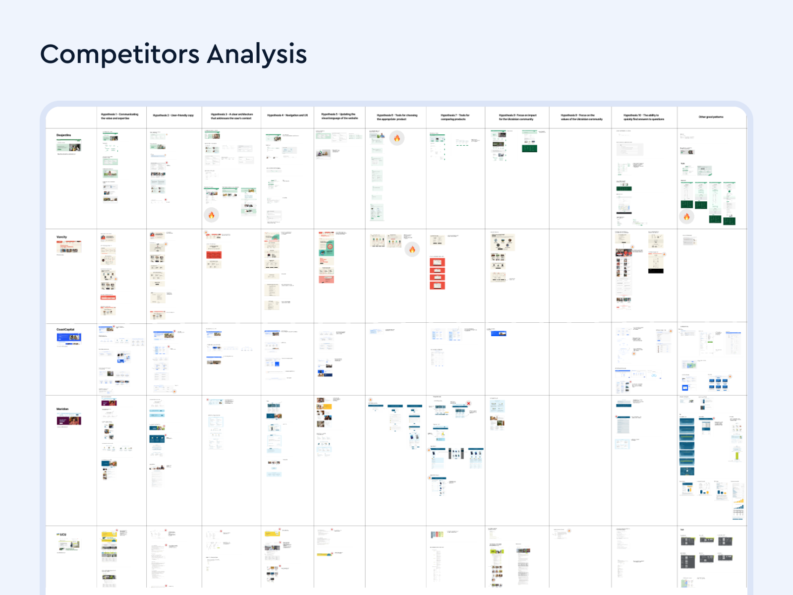
To understand how we can differentiate BCU’s digital experience, we analyzed 10 competitors’ – highlighting both good and poor usability patterns. This helped us define what users expect when comparing financial institutions online, identify common approaches to simplify UX and uncover opportunities to make BCU’s customer experience stand out.
4/9
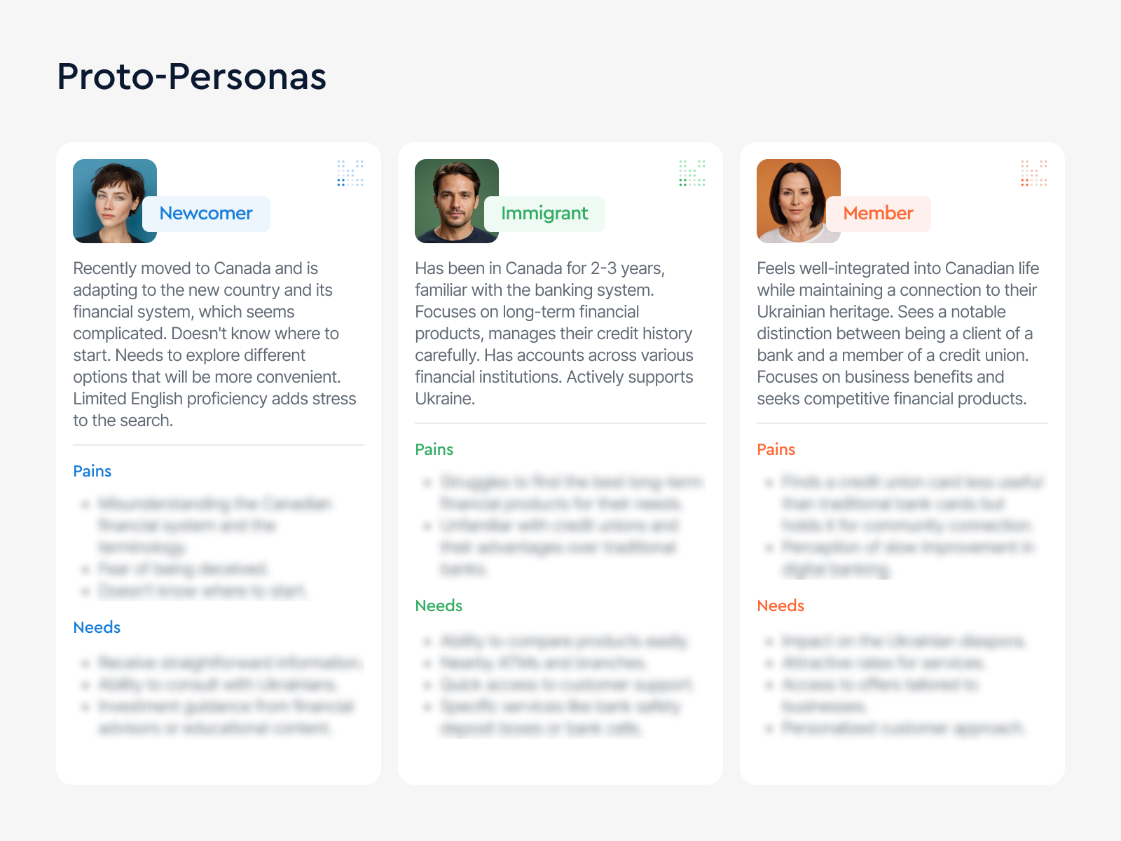
To guide early design decisions and refine them later with real data, we created a proto-persona – a preliminary, less detailed version of a persona based on team assumptions and initial insights.
5/9
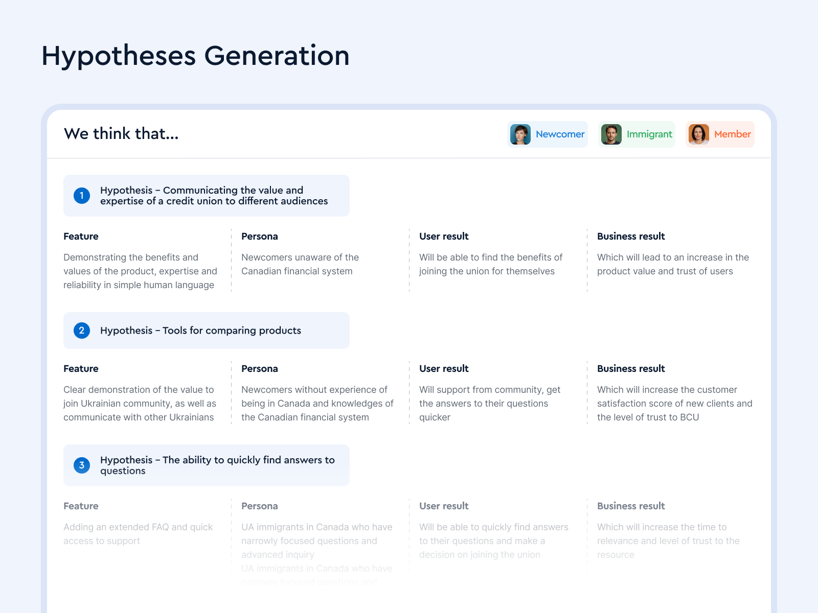
As part of the research phase, we generated a set of hypotheses based on user interviews, business goals, and industry context. Each hypothesis addressed a specific area for improvement. This helped us validate what works in the real world and adapt best practices to fit BCU’s brand, audience, and platform structure.
6/9
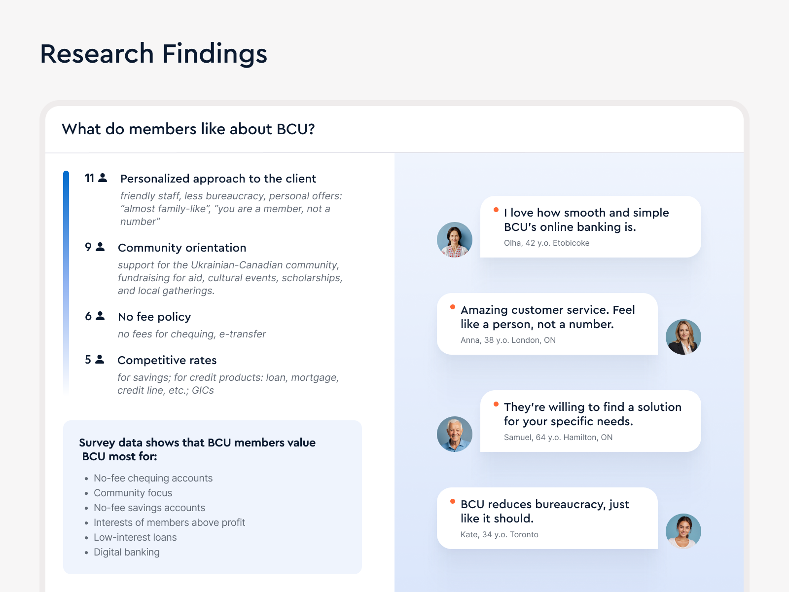
Our team conducted 24 in-depth interviews with the target audience and an online survey with 200+ BCU members to examine the banking experience in Canada and gather insights for the BCU website redesign. The combined research helped us prioritize the pain points and needs of the target audience – providing a clear foundation for design and content decisions.
7/9
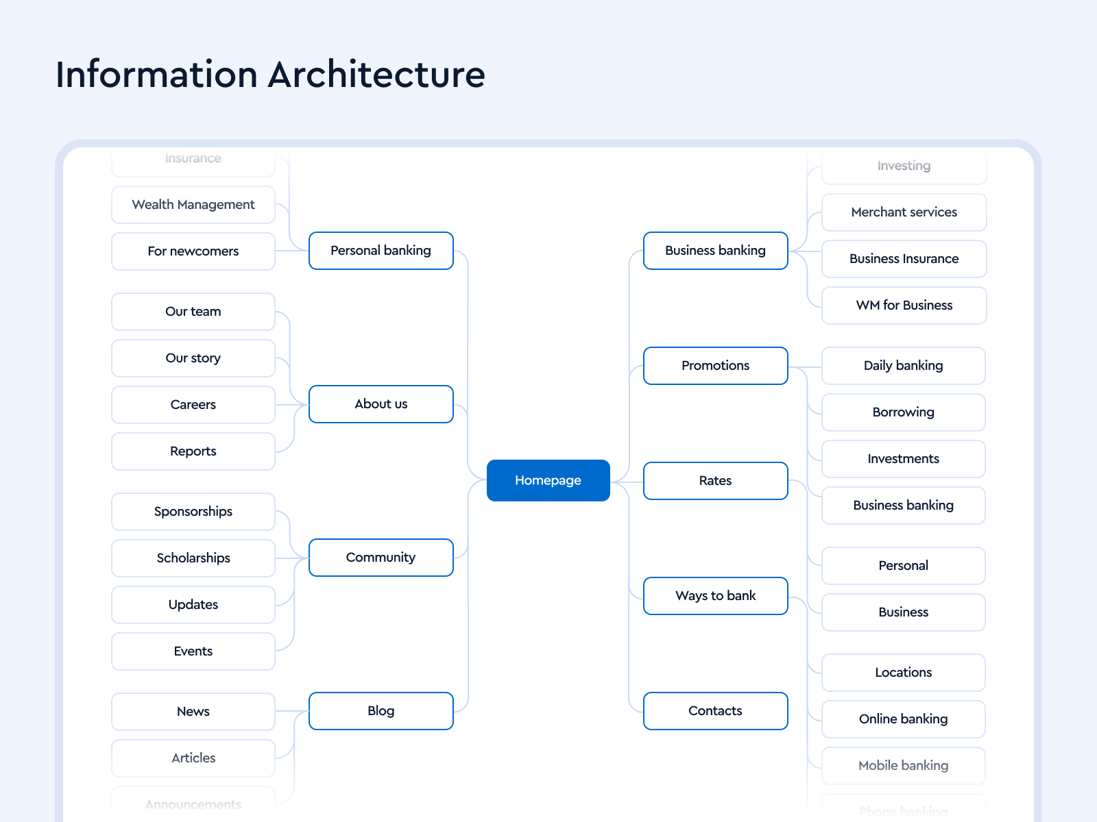
The design process began with information architecture. We turned research insights into a clear structure defined by key user jobs. Based on that, the existing sitemap was revised to focus on levels, sections, and user intent. We also introduced reusable components to help the BCU team scale pages easily. The final structure followed a modular layout with clean hierarchy, intuitive grouping, and flexibility for future content updates.
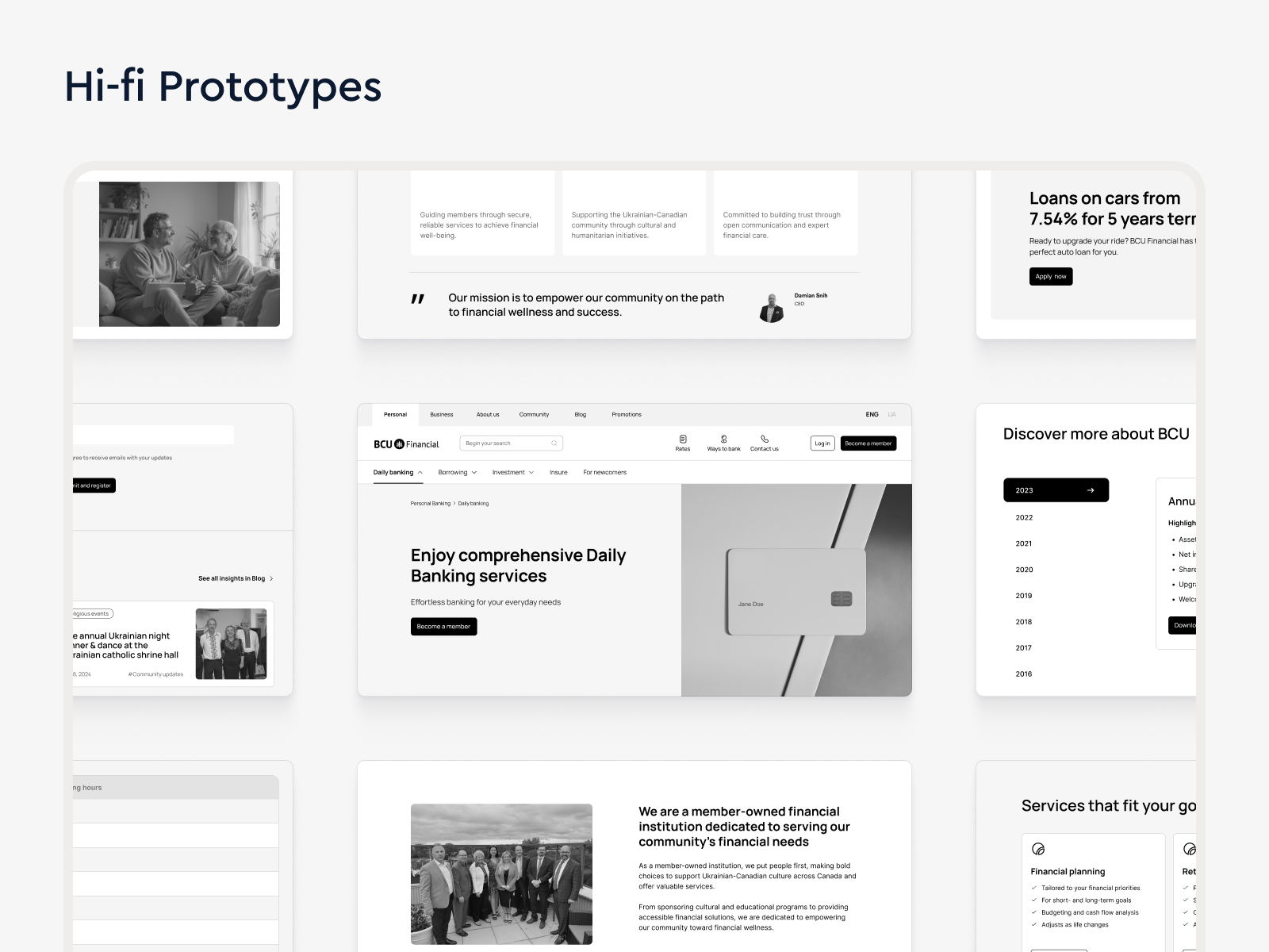
8/9
At this stage, we focused on bringing clarity and depth to the design. We detailed the prototype, reviewed content, and refined key messages and labels – making sure every word matched business tone. A big part of the work involved co-creating with stakeholders, especially around content: aligning meaning, reviewing copy, and filling in gaps where information was missing.
9/9
Visual discovery & Creation of the design system. This stage focused on auditing existing elements to determine what to keep, improve, or replace. Based on this, we defined key styles aligned with the BCU brand. The outcome was a comprehensive UI kit and component library – covering everything from buttons to layout patterns – forming a scalable design system for all 3 BCU platforms.
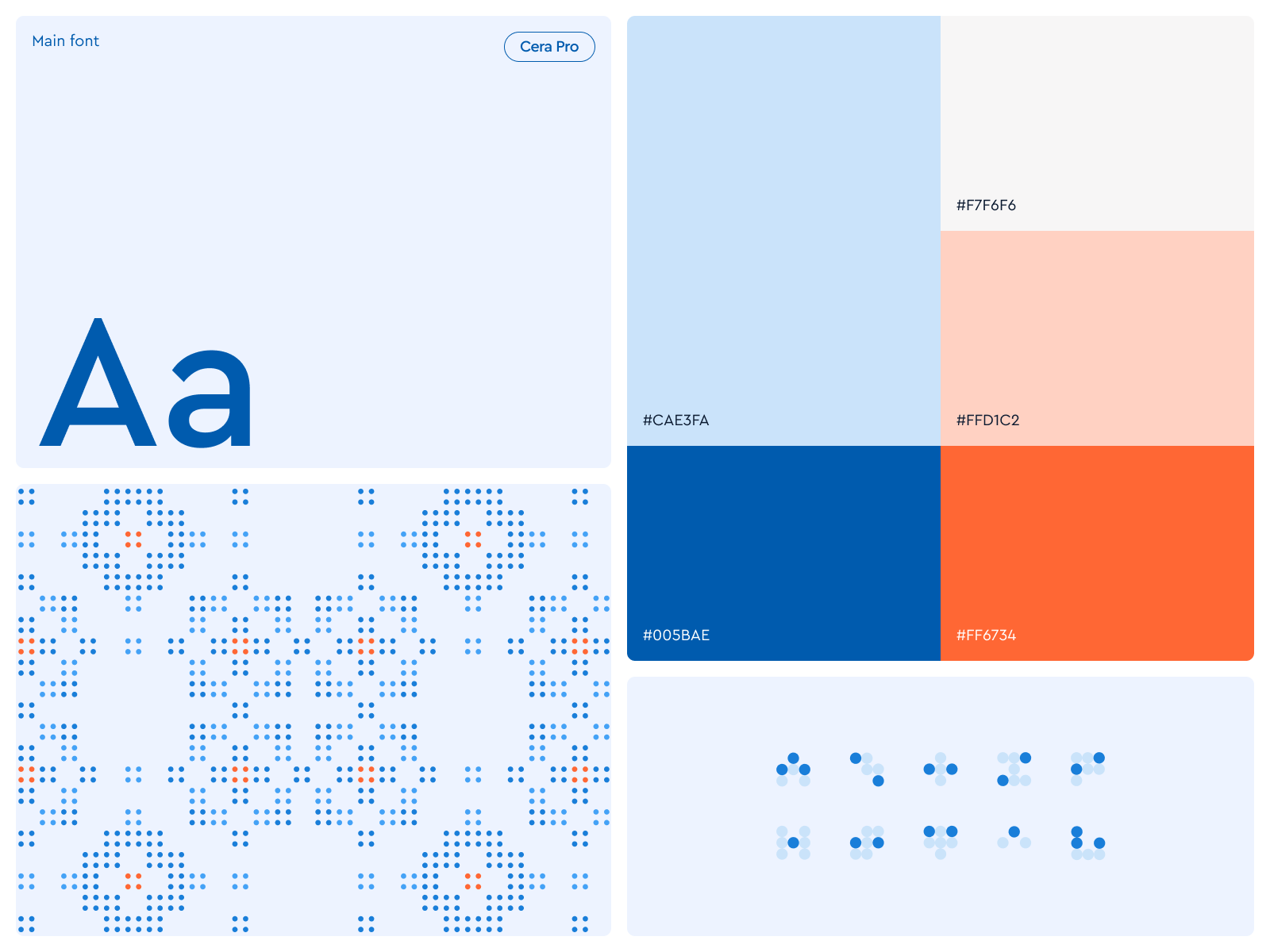
Metaphors in visual design
A unique part of this project was the work we did around senses and visual meaning – something we believe deserves special attention. Design isn’t just about layouts and colors. It’s also about what people feel and associate with when they see certain forms or patterns.
Circles as coins. One of the early concepts used circular shapes as a base, evoking coins and financial movement. This subtle metaphor helped create a sense of familiarity, trust, and clarity around money.
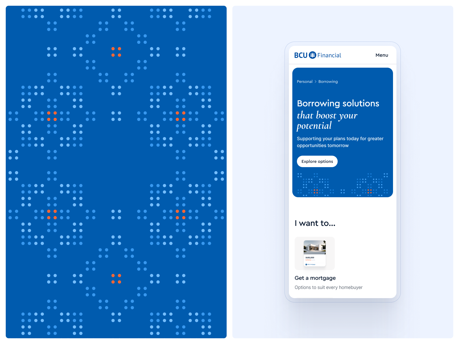
Ukrainian embroidery patterns. Since BCU has strong cultural roots in the Ukrainian-Canadian community, we explored national visual symbols. Traditional embroidery elements became part of the final design, adding depth and cultural connection to the interface.
These concepts helped shape a design that not only works, but also feels right for BCU’s members.
Methods we applied
Proto-personas creation
UX audit with UX walkthrough methodology
Competitors analysis
Hypotheses generation & development
Quantitative part: online survey
Qualitative part: 24 in-depth interviews
Data analysis and synthesis
Low- & High-fidelity iterative prototyping
Design concept with visual metaphors
Co-design session facilitation
UI kit and components library
Development
Team Behind the Project
UX Lead: Quality and consistency in all UX research activities.
Research Lead: Research design, management, process organization.
To provide the best experiences, we use technologies like cookies to store and/or access device information. Consenting to these technologies will allow us to process data such as browsing behavior or unique IDs on this site. Not consenting or withdrawing consent, may adversely affect certain features and functions.
Functional
Always active
The technical storage or access is strictly necessary for the legitimate purpose of enabling the use of a specific service explicitly requested by the subscriber or user, or for the sole purpose of carrying out the transmission of a communication over an electronic communications network.
Preferences
The technical storage or access is necessary for the legitimate purpose of storing preferences that are not requested by the subscriber or user.
Statistics
The technical storage or access that is used exclusively for statistical purposes.The technical storage or access that is used exclusively for anonymous statistical purposes. Without a subpoena, voluntary compliance on the part of your Internet Service Provider, or additional records from a third party, information stored or retrieved for this purpose alone cannot usually be used to identify you.
Marketing
The technical storage or access is required to create user profiles to send advertising, or to track the user on a website or across several websites for similar marketing purposes.


