UX/UI redesign to boost usability in eCommerce site

Usability-focused UX/UI redesign for beauty eCommerce brand VSB Store
#Case study
VSB Case Study Cover

Our team helped VSB Store enhance its user experience while keeping the branding consistent and familiar to existing users. Through a usability-focused redesign, we improved navigation, clarified the loyalty system, and set the stage for better user engagement.
Logo
  • Client
    VSB Store
  • Location
    Ukraine
  • Industry
    eCommerce, pro beauty supplies
  • Timeline
    3 months

About the Client

VSB Store is a wholesale and retail platform offering a wide range of professional beauty products for salons and individual specialists – from permanent makeup and manicure tools to cosmetics and salon equipment. 

Known for its customer-centricity, VSB has become a recognized name in the beauty supply market. With thousands of active users each month, the brand continues to attract and retain a loyal audience. This focus on customers helps VSB build a client base driven more by customer loyalty rather than traditional advertising. To support this growth and make their site even more user-friendly, they turned to us for a UX-focused redesign.

Project Goals

In eCommerce, every detail counts. From catalogue navigation to the checkout flow – each step impacts whether a customer makes a purchase. That’s why the main goal of this project was to improve how users perceive and interact with VSB Store by enhancing the overall user experience. It included:

Functional UX improvements. The goal was to fix friction points in the user journey. We had to make key flows – like login, catalog navigation, product filtering, checkout and loyalty system browsing – more intuitive through targeted enhancements. These changes had to be made at the component level, without rebuilding the information architecture or adding major development work.

Visual enhancement. Refresh the website’s look and feel without stepping away from the existing brand identity. This is a kind of evolutionary UI improvement – not a full redesign. 

Challenges

Category structure. Even before the internal UX audit, the client came in with direct feedback from their users  – navigating through too many categories was complicated. Website analytics confirmed this: only 5% of users scrolled to the end of the filter sidebar. This suggested possible overload and highlighted the need for structural changes.

Design within existing branding. One of the goals was to preserve the existing visual identity and user context. The updated design had to feel familiar to returning customers and respect established behavior patterns. At the same time, it had to look cleaner and more modern.

User first. A natural question came up: why not use a standard eCommerce template like those offered by Shopify? But beauty industry customers – mostly professional stylists and technicians – don’t behave like general eCom users. Navigation had to reflect their patterns and needs. That meant customizing flows based on real behavior, not just best practices.

Loyalty system structuring. The existing loyalty program was already well developed but needed better structure and visibility inside the user account. Simplifying how users track and manage their rewards became part of the UX improvement scope.


Process explained

  1. We began with a kick-off meeting to align on goals, scope, timeline, and deliverables. This session helped establish a shared understanding between our team and the client, clarify priorities, and set a roadmap for the work ahead.
  2. We analyzed existing user data (Clarity, Google Analytics) to identify how they interact with the site and key metrics worth attention – conversion rate, engagement rate, scroll depth, and average session time, which reflects overall browsing behavior.
  3. 2 UX auditors conducted a detailed walkthrough of the current site to map out strong UX patterns, find correlations between behavior patterns, key metrics, and the existing interface. This helped us identify pain points and define areas for improvement. 
  4. Based on UX findings, we created low-fidelity prototypes highlighting key improvements and prepared an initial UI concept that reflected both the UX changes and a refreshed visual concept on key pages – homepage, catalog, and product. Special focus was given to usability, drawing on best practices from the Baymard Institute, NN/g, Smashing Magazine, and our own Usability Principles by Craft Innovations
  5. We developed a new visual concept to align with both brand aesthetics and the improved UX. The updated visual language kept the familiar branding while adding a modern touch. Once the concept was approved, we redesigned all major page types and created a design system in Figma to ensure consistency and adaptability across desktop and mobile.
  6. We prepared detailed specifications for the development team, including annotated Figma files and documentation explaining how UX logic had evolved. Since the client’s in-house team was responsible for implementing the changes, our approach ensured smooth communication during handoff and minimized gaps throughout development.
  7. We’ve handed over the final designs to the client’s development team, who are now working on implementation. Our team continues to provide support as needed during this phase. Once the updated site goes live, we’ll run QA to ensure everything works as intended and track updated metrics to compare against the baseline collected before the redesign. And we’ll share the measurable results here:)

VSB Case Study Process - before and after

Key UX issues & Our solutions

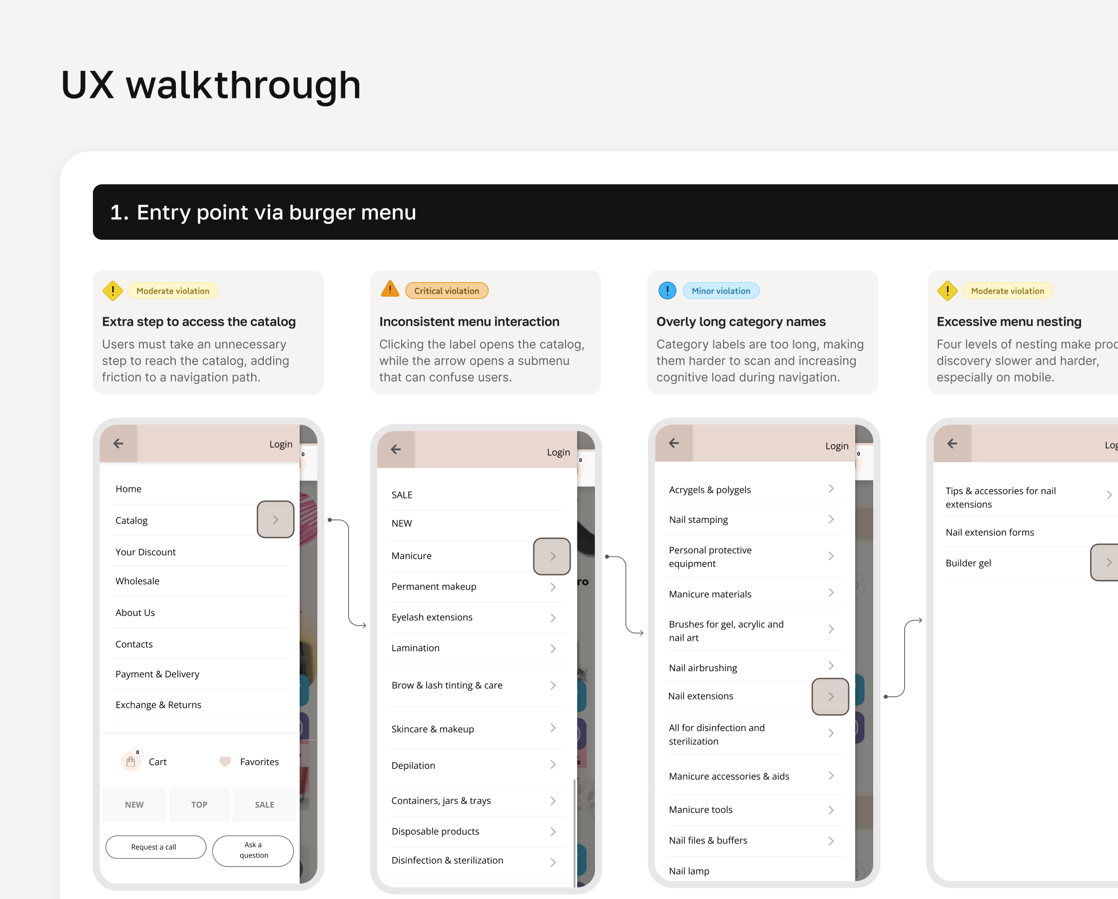
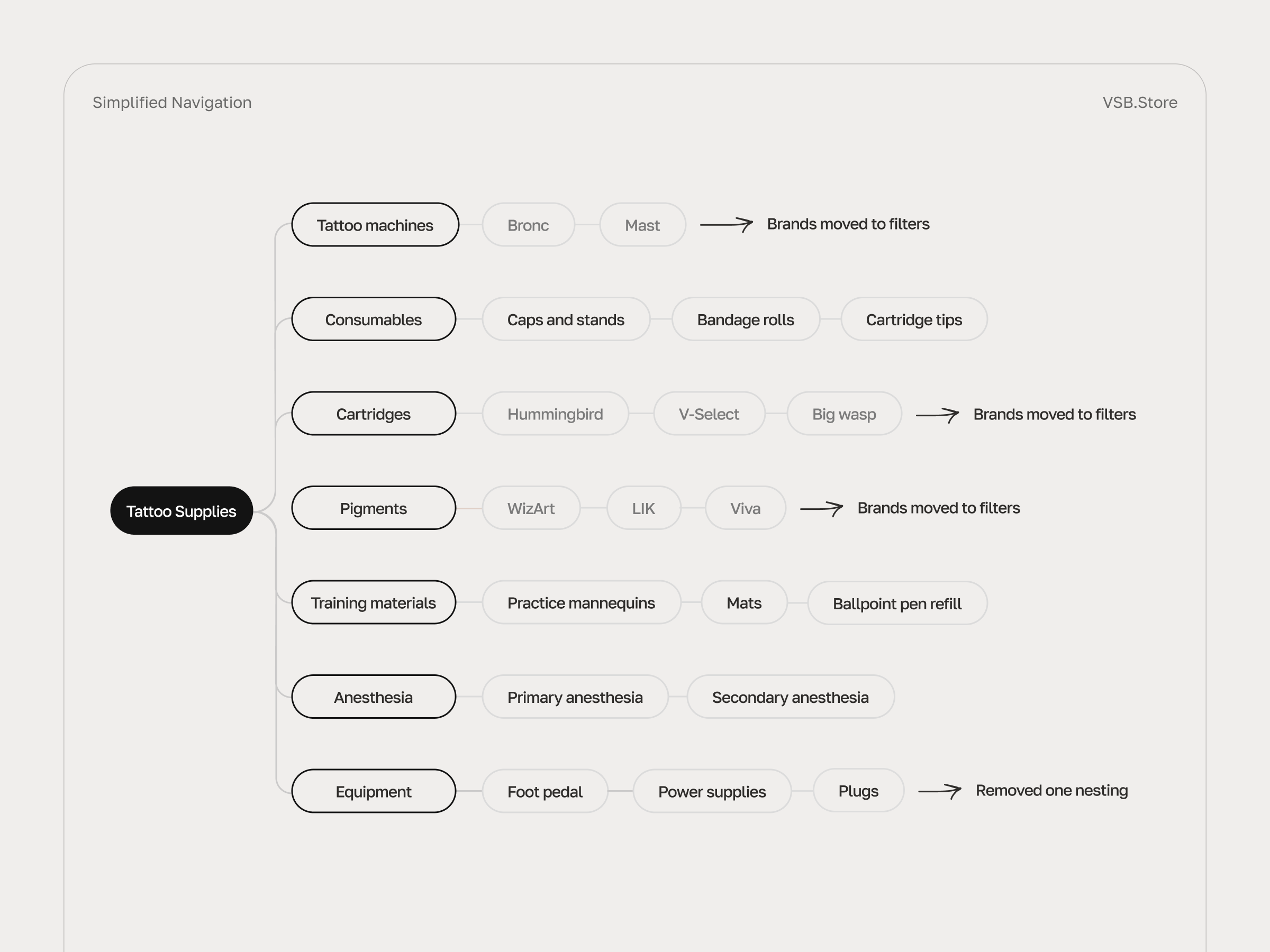
Over-categorization in catalog 

🤔 One of the biggest UX challenges was the structure of the catalog menu. It had too many levels, and even individual brands were listed as separate categories. That made browsing harder – especially for users who wanted to view a few specific brands at once. With up to 4 levels of nesting, the hierarchy limited search options.

💡 To make product discovery faster and reduce drop-offs during early-stage navigation, we simplified the catalog structure by moving overly narrow categories  into filters. Also, we added tabs directly on the catalog page to allow easier in-page navigation, reducing reliance on the menu alone. Subcategories were restructured into a flexible filter group, helping users select several at once instead of drilling down through levels. 

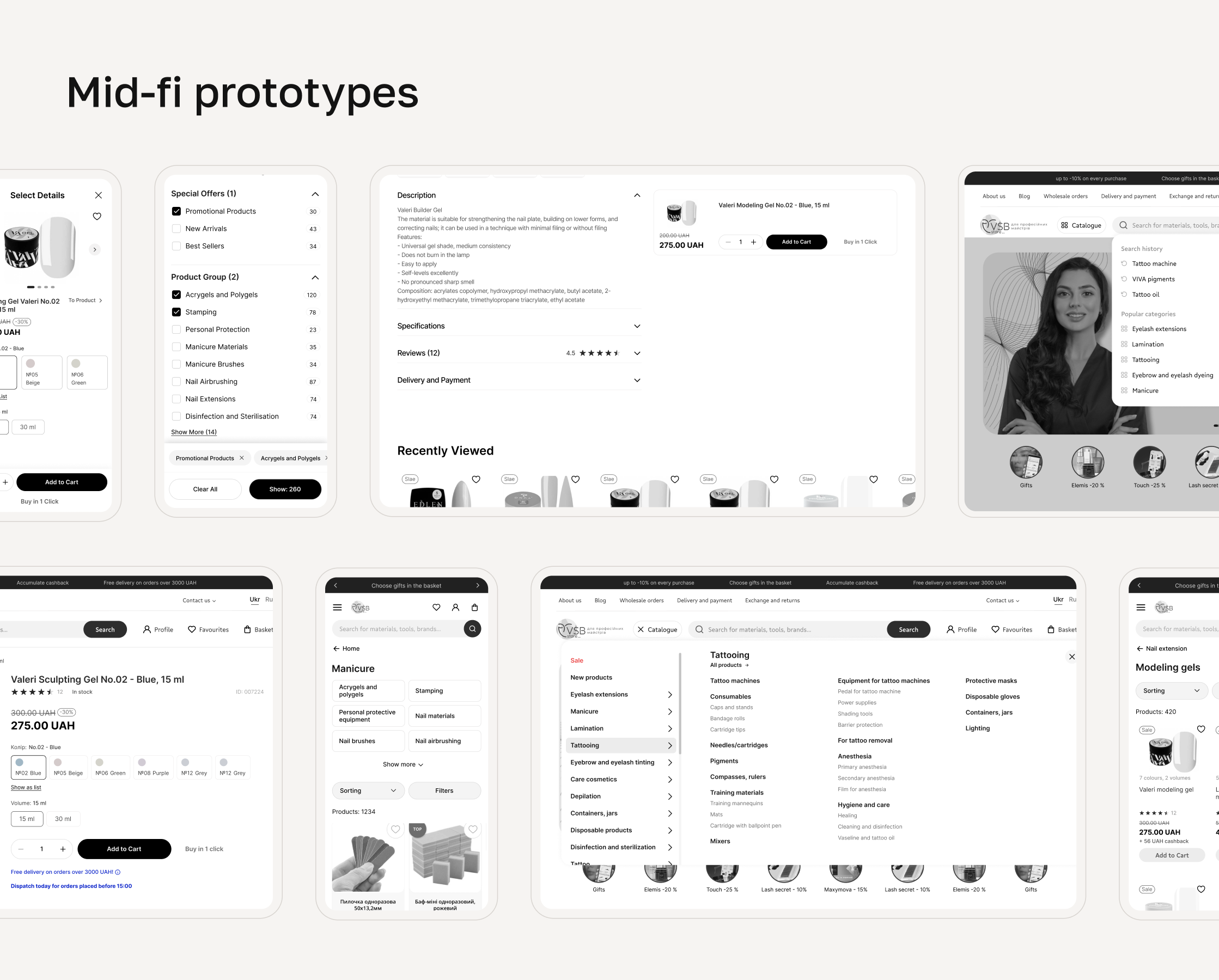
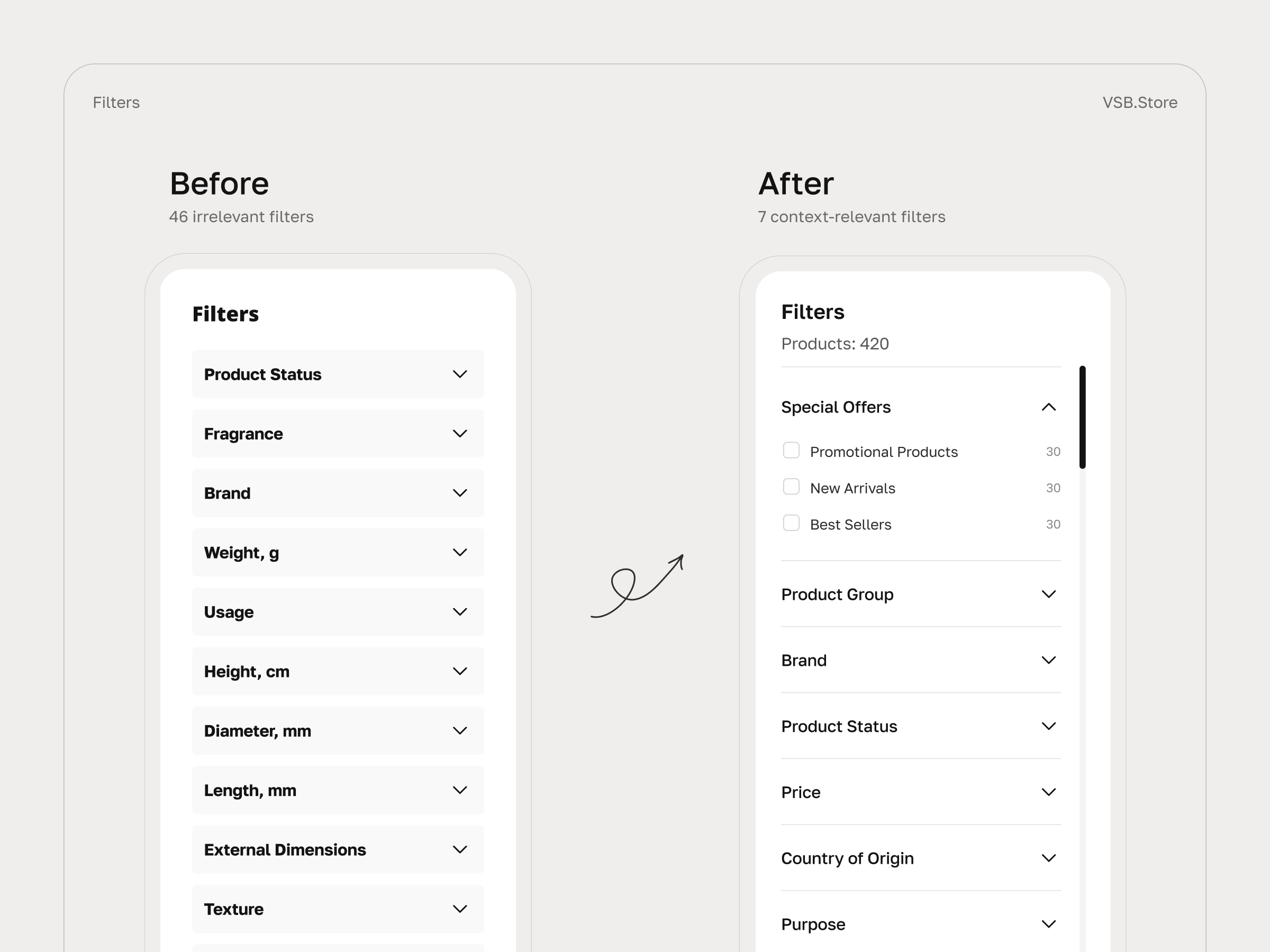
Too many specific filters, too early

🤔 During the UX audit, we noticed some categories on top-level catalog pages had up to 46 filters, many of which were too technical or specific too early. For example, someone browsing “Manicure” would already see a filter like “Rotation Speed” – without enough context to understand what it refers to. On top of that, filters were placed too far down the page, so users had to scroll a lot just to spot them. 

💡 To increase filter usage and reduce time to checkout, we reorganized the filtering system to prioritize the most relevant, high-level filters first. This reduced cognitive load and helped users narrow down results more confidently. Technical and product-specific filters were moved deeper in the funnel – where users already had enough context to use them.

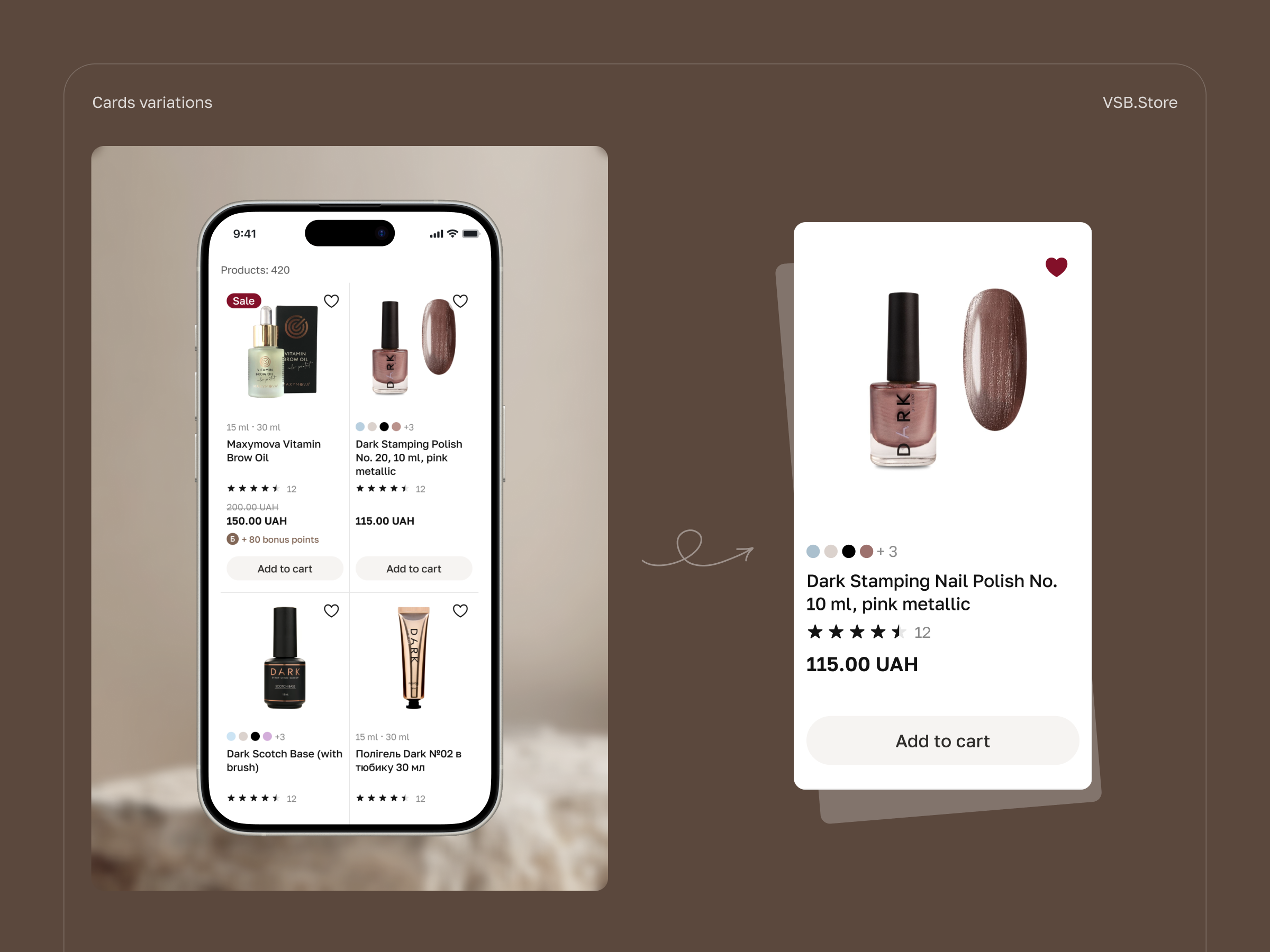
Product variations shown as separate items

🤔 Product variations were displayed as separate items in the catalog. For example, each color or bottle size of the same nail polish appeared as a standalone product. This cluttered the catalog and made it harder for users to compare or choose what they needed.

💡 To increase product views per session and reduce bounce rate from catalog pages, we grouped variations into single product cards – so users can now select the right color or size directly on the product page. 

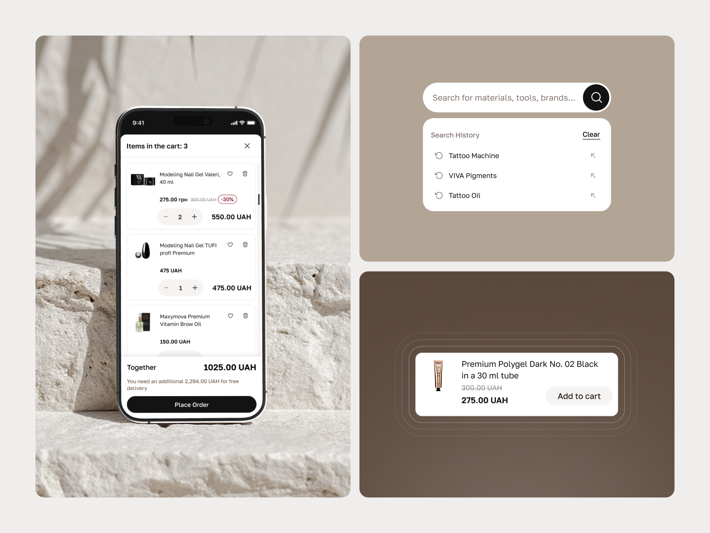
Ineffective search without autosuggestions

🤔 Product search didn’t offer autosuggestions and was highly sensitive to language or misspellings – which often led to zero results even if relevant items were available. This created dead ends for users and increased frustration.

💡 To improve search efficiency, we implemented autosuggestions and error-tolerant logic. This would help users find what they need faster, even with typos or language mismatches – ultimately supporting higher user engagement.

Lack of transparency in the checkout process

🤔 We discovered that the checkout process had multiple steps and automatically registered users without notifying them. This created confusion – many users didn’t realize an account had been created and later had to reset their password to log in. The experience felt unclear, especially for those just trying to place an order.

💡 To improve checkout completion and make the process more transparent, we designed a single-step flow with clear messaging. Users can now buy as guests or log in if they have an account. Registration is offered after purchase – when it doesn’t interrupt the buying process and personal data is already filled in.

Team behind the project

Design Manager acted as the primary point of contact between the client and the development team. Oversaw the project’s design strategy, including supervision, mentoring, planning, and execution. Also took on the role of UX auditor – reviewing user behavior, identifying friction points, and guiding the team on what to improve and why.

Lead Designer led all design processes throughout the project and presented solutions to stakeholders. Alongside core design work, also acted as a UX auditor, analyzing user flows and aligning improvements with both business and user goals.

UX/UI Designer assisted with prototyping, component design, and developer handoff. Researched best-practice UX patterns and played a key role in shaping the refreshed visual concept.